Tuesday, 28 February 2012

Teetering toiling, wheeling stumbling...

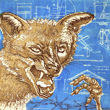
The initial design and text is etched on the plate; Captain PB is striding forth and gathering momentum. Not quite sure how to manage the background at the moment… some scribbling on copies of the print needed I think.

Tuesday, 21 February 2012

Momentum

The second image in my Captain PB series is well under way; the plate is all ready for its first etching. It feels good that this work is gaining momentum… which I think is the title of this piece. I have no idea where I'm going with this once the initial design is etched but I suspect the Captain knows.

Thursday, 16 February 2012

Yakusha-e: Kabuki prints, a continuing tradition

Yesterday was Excursion Day; Escape From Routine Day, Change of Scene Day, New Input Day. Target destination: the Ashmolean Museum in Oxford to see an exhibition of Japanese prints, wander the antiquity-filled halls and partake of coffee and cake in the café (very good cake it was too).

The exhibition, Yakusha-e: Kabuki prints, a continuing tradition, shows images of Kabuki actors over the centuries . The prints were made by three Japanese artists – Utagawa Kunisada (1786-1864), Toyohara Kunichika (1835-1900) and Tsuruya Kokei (born 1946).

Kabuki theatre began in the early 1600s. The actors became celebrities, much like film stars today, and attracted a huge fan base. There was a high demand for images of the actors which kept the artists busy providing drawings to be made into prints. The drawings would be passed on to engravers who would carve the blocks. These in turn would be handed over to printers for printing. These prints (and those with other subject matter such as landscape and historical images) were known as Ukiyo-e; pictures of the floating world.

A subset of Ukiyo-e, Yakusha-e depict actors striking dramatic poses - ‘mie’. Traditionally these were full-length figures with minimal backgrounds but from the 1790s, artists began to vary the designs to half-length portraits and dramatically cropped views of head and shoulders – Okubi-e. This had the effect of bringing ardent fans closer to their favourite stars (or at least, giving them that feeling), and facial features and expressions could be emphasised. Bright red makeup was used to heighten emotion – I particularly like the images where the subject is cross-eyed; this indicated a moment of emotional climax. They look rather comical but presumably it was all deadly serious. Motifs on the costumes often depicted the content of the play.

I like ukyio-e; but to my untrained eye, they've always looked a bit samey to me. However, seeing the work of Kunisada and Kunichika side by side, the differences in style are quite evident. Kokei’s work is different again and has a more modern, graphic feel to it, and in fact, he carries out all stages of the process himself from drawing to printing - unlike the customary methods followed by Kunisada and Kunichika. He shows though that this 400 year old tradition is still very much continuing. An interesting exhibition should you be in the vicinity before 4 March.


Images from top to bottom:

Cross-eyed villain, Toyohara Kunichika, 1869, 35.5 x 24cm

Actor as Yura Hyogo holding a fan, Utagawa Kunisada, 1852, 35.5 x 24.3cm

Nakamura Tojuro as Kasane, Tsuruya Kokei

Masaoka, Tsuruya Kokei

The Actor Ichikawa Danjuro XII as Sasaki Takatsuna in The Chronicle of Three Generations in Kamakura, Tsuruya Kokei


Sunday, 12 February 2012

Eric Ravilious: terminal optimist

I went to a talk about the life and work of Eric Ravilious this week. I’m familiar with his wood engravings but knew little of his life or his paintings so thought I’d take an early lunch break and trot along to the FOSMAG lecture in town.


Born in 1903, it seems that Ravilious had a pleasant childhood and uneventful adult life (before it was tragically cut short in 1942 when he was just 39). I say uneventful; he married (and had affairs), had three children and a very successful career in design before being commissioned as a war artist at the outbreak of the second world war. I guess what I mean is that as far as I k
now, his life seemed relatively trauma-free. And by all accounts he was terminally cheery. Fellow artist and friend Douglas Percy Bliss said, ‘I never saw him depressed. Even when he fell in love – and that was frequently – he was never submerged by disappointment. Cheerfulness kept creeping in.’ How tiring that must have been for everyone around him.


Even in the throes of war, he seemed abnormally optimistic. About his post in the Observer Corps on Sudbury Hill, he wrote: ‘We wear lifeboatmen's outfits against the weather and tin hats for show. It is like a Boy's Own Paper story, what with spies and passwords and all manner of
nonsense.’ And in the midst of bloody sea battle off the coast of Norway: ‘I enjoyed it a lot, even the bombing which is wonderful fireworks.’ Insane.


This cheeriness filters through to his war paintings, which rather leave me cold. Whilst I don’t dispute that he was a talented artist, to me his watercolours feel like an extension of his design work and have nothing of the horrors of war about them; there’s no angst or real sense of drama. The pale colours and simple shapes might look more at home as fabric designs (I
wouldn’t mind his cheery boats and planes bobbing across my curtains…). His wood engravings on the other hand, are a whole different ball game - much more effective. Think I'll stick with those.


Sunday, 5 February 2012

The Creative Dreamer

I’m reading a rather interesting book at the moment; The creative Dreamer by Veronica Tonay PhD. The subtitle is ‘using your dreams to unlock your creativity’, which sounds a bit cheesy – more cheesy than the book actually is. So far anyway.

The first two thirds of the book are all about the psychology of dreaming, creative personality types and how the two fit together. There are some interesting statistics about the likelihood of creatives experiencing certain events and situations as a child and of the personality traits they may have as an adult. What I wanted to mention here though are the differences researchers have found between how men and women dream. Mostly, both genders dream in a similar way (as do people across cultures), but there a number of differences. Apparently, women dream equally of men and women whereas men dream more often of men. Women dream more often of people familiar to them whereas men dream of strangers more often. Research has shown than aggression is very common in dreams; women dream of themselves as the victims of another’s aggression more often; men have more aggression in their dreams and are more often the initiators than women. Women have roughly the same number of friendly and aggressive dream encounters, whereas mean have aggressive ones more often than friendly ones.

These are the findings having analysed the ‘average’ person’s dreams. Creative people however, seem to be more androgynous in their dreaming; the gender boundaries are blurred and there is more of a mix of the elements mentioned above. This is apparently because creative people tend to be more psychologically androgynous in that they display both feminine and masculine personality traits. Interesting stuff, although not sure where this is all leading. Better read on to find out…

Tuesday, 24 January 2012

It's all in the wiping

The background aquatint is done. It’s a bit darker than I’d planned so the text is hard to read (more so on this scanned version) but I don’t think I mind that. I warmed the plate for the final wiping of the central figure for greater contrast but left the plate cold for the background. Tried wiping it warm to make it a bit lighter but it didn’t look right.

I think this image is finished but I’m not quite sure… I’ll put it away for a few days and come back to it with fresh eyes (hopefully). In the meantime, I’ll consider what Captain PB’s up to next.

Thursday, 19 January 2012

out, out towards the horizon

Finally finished working the text onto the plate; must have taken five hours just to do that bit. The text is just nonsense really. I didn’t want it to say anything specific but to suggest a sense of travelling.

This afternoon I put an aquatint on the plate to darken the area around the figure so that the text recedes a bit. There’ll be a bit of trial and error here to get the tone right; I want the background to be dark enough to bring out the figure without losing the text.

Sunday, 15 January 2012

Working away on the text this weekend. It’s intricate and slow-going but with a bit of John Dowland on the old ipod, I’ve been able to get into that zen-like state where there’s nothing but the line you’re making - it takes as long as it takes. Hoping to get the majority of the text finished today so I can etch next week. My plan is then to aquatint over the text so that it sinks into the background. I have a mental image of how it will look but part of the magic of printmaking is that quite often, things turn out differently to how you imagine.

Thursday, 5 January 2012

You can’t keep an old etcher down

After a hiatus of about six months, it’s good to be etching again. I started this image as a wood engraving but the call of the aquatint was too strong, so here he is on a 20 x 30 cm zinc plate. I’m trying to work more quickly and haphazardly, not so meticulously with this one so we’ll see how that approach goes; I’m pleased with how he’s coming along so far though. Working on some text to go with the image now.

Whilst I was at it, I mixed up a new batch of copper sulphate solution – quite a pleasing New Year ritual. The vibrant blue of the copper sulphate crystals and the way they turn green and yellow when mixed with salt and hot water, then back to a blue solution made me think of Spring. Not that I’m wishing my life away, but the days are getting longer now…

Friday, 30 December 2011

The Arnolfini in Bristol

I went to Bristol yesterday to see a friend and took the opportunity to visit the Arnolfini, the city’s contemporary art gallery. Bit of a nostalgia trip too – used to visit the gallery regularly when I was at art school just across the bridge in Wales.

There are two exhibitions on in celebration of the Arnolfini's 50th anniversary. The first is Museum Show Part 2 which was a collection of ‘museums’ with titles such as the Museum on Non-Participation, the Museum of Television and the Museum of Forgotten History. This is the second part of a sort of survey of museums created by forty artists from around the world and consists of installations including a wide range of objects. The above image is the one I found most pleasing.

The second exhibition is Self-Portrait: Arnolfini by Neil Cummings; a series of water droplet-shaped patches with text on them arrange throughout the foyer and up the stairs of the gallery. The text gives various facts about the history of Bristol and the gallery starting from the Bristol Riots of 1831 through to 2061, 100 years after the gallery opened, as well as details of world organisations and advances in technology. The shapes are colour-coded: pale blue for the history of the Arnolfini and art in general, olive green for social and financial organisation and purple for technological innovation. The whole forms an elaborate timeline based on fact and flowing off into speculation - which actually drew me in more than I thought it would. Where the text which is purely speculative is laid out in exactly the same way as that which is historical fact, it's very easy to be sucked in to believing all is truth.

The Museum of Museums left me cold I’m afraid, as it seems most conceptual art does these days. I’ve been thinking about why this might be, having had a keen interest in it in the past. I can only assume that it’s because that brand of art is so far removed from my current situation, irrelevant to my life as it is now. I guess I just don’t have the time or mental energy to ponder these things anymore. Give me a painting by Vermeer or a Paula Rego etching any day - not that these aren’t thought-provoking of course; they most certainly are. They give me something conceptual art doesn’t though.

Tuesday, 20 December 2011

Origins

Over the last few months I’ve been thinking on and off about beginnings and endings, birth and death, and how development is affected by external factors. I was weaving this into an etched self-portrait but as my etching mojo seems to have taken what I hope is just a temporary leave of absence, I need to rethink and carry this work in a new direction and in a new medium.

Foetuses are a rather obvious place to start as an emblem of new beginnings, but start there I shall. The drawing above is in the process of being transferred to a wood engraving block and will, I think, be surrounded by some text.

Finished frog

And here he is, tidied up. Just took out some of the odd bits that I missed before proofing. Amazing what a difference that makes, although obviously, still pretty rough. I'd be embarrassed to show it to a real wood engraver. It was fun to do though.

Sunday, 11 December 2011

First proof

Took the first proof off my block yesterday and here it is; pretty rough around the edges but not as bad as I thought it would be... although possibly looks more like a wood cut than a wood engraving. Needs some tidying up. Oh and I need to order some relief ink as my tin had completely dried up (had to print it using etching ink) – shows how long it’s been since I last did any wood engraving!

Block size: 750 x 500 mm, 3 x 2 inches

Sunday, 4 December 2011

New glasses can wait

It seems I've found the solution to the problem of not being able to see what I'm doing on my wood block. Forget the new glasses; look what I found lying around in the studio (inherited from my father who was always making something and was very long sighted). This magnifying lens on a stand is the perfect size and shape – my sandbag fits exactly underneath. Working on the block this afternoon has been much easier. Well, from the point of seeing what I’m doing that is.

The image is very slowly taking shape – hope to be able to take a proof soon. My main problem is bruising the edges of the cuts with the bottom of the tool. I need to take some advice from Someone Who Knows about this and what I can do to stop it. I’m a bit embarrassed to show the block to a real wood engraver though as it’s so rough and badly done. Ah well, I’m not planning to use it for anything – it’s just for practice.

Sunday, 27 November 2011

I may need new glasses


Having made a start on a wood engraving, I am reminded of how fiendishly difficult and slow-going it is. I’m struggling to see what I’m doing too. After working on the block for an hour this afternoon, I scanned it and blew the image up large on my computer screen – what a mess! Shudder to think what’s going to come out when I finally get to the proofing stage. I’m beginning to regret adding the text – really fiddly. This is a maple block, 75 x 50 mm (approximately 3 x 2 inches).