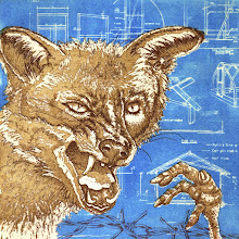
As mentioned in my previous post, I was able to spend quite a large portion of the Easter weekend working on my Green Door print exchange submission; the Datamonger.This image came about as a result of a conversation I had with Georgia, fellow data analyst.I’d been telling her about a trip to the local fishmonger (what exciting lives we lead!) and she decided that as data analysts-cum-statisticians, we are datamongers.
I don’t know whether it was because I had a more sustained period of time in the studio over the weekend, which stimulated my creativity generally, but The Undertaker’s Nuptials is underway again.The Datamonger, purveyor of rare and exotic numerals, has entered the narrative now so more images are on the way.
The few days over the bank holiday weekend have been quite intensely printmakerish and really rather good.As well as getting plenty of studio time to work on my Green Door print exchange submission (more on that later), I was able to see Urban Evolution, an exhibition of prints by Anne Desmet at St Barbe Museum and Art Gallery in Lymington.It’s an intimate space, ideal for her linocuts, wood engravings and collages, most of which focus on architectural themes.That’s an extremely inadequate way to describe the exhibition - Anne Desmet takes wood engraving to a whole new level – but I think I need to digest the exhibition catalogue before I can say more.
Today at Red Hot Press, I had the opportunity to see a demonstration of a new etching ground developed by Andrew Baldwin at AberystwythUniversity.Sarah heard about the ground at last year’s Impact conference in Bristol and has been using it since with good results.The beauty of this ground is that it doesn’t give off unpleasant fumes like other liquid hard grounds and is therefore safer to use – a big plus for educational establishments and open access workshops.It doubles as a hard and soft ground too.It’s rolled onto the plate like ink and at this point can be used as a soft ground, or bake it on the hot plate for half an hour and you have a hard ground.It’s red instead of the traditional brown which makes working on and etching the plate easier too.Sarah’s not sure if it’s available commercially yet but she gives it the thumbs up so I hope to give it a go sometime soon.
Image: Anne Desmet, Deserted Pool VMB, linocut 2007
I paid my annual visit to the Mall Galleries on Saturday for Originals 10, the top UK open exhibition for contemporary printmaking in which works by emerging talent hang along side those of established printmakers and members of the Royal Society of Painter Printmakers.Virtually every printmaking technique is covered from etching (check out Martin Ridgwelland MychaelBarratt), wood engraving (Hilary Paynter was on excellent form as usual), linocuts (Gail Brodholdt and Angie Lewin) and mezzotints (Martin Langford) to collagraphs, screenprints, digital and lasercut works.
In past years the show has felt a bit samey; same people showing the same kind of work, but this year, there seemed to be much more of a range of techniques and styles.In Venetian Diary III, MilaFurstova had wrapped her etchings of Venetian buildings in sheets of clear acetate covered in handwritten text, rolled into tubes.Jenny Smith’sCircles II and Circles IV are laser cut screen prints, combining a traditional printmaking technique with the relatively new technology of laser cutting.Carol Hensher specialises on printing on fabric; My fingers grasp at floating feathers comprises four white silk evening gloves with hands printed on them using lithographic methods.Fiona Hepburn cuts out hundreds of tiny woodcut and screen prints and fixes them in clusters using pins to create intricate fungal and bacterial forms.
My own tastes are more traditional; I find myself drawn to figurative works with something of a narrative in them.Personal favourites were Jessie Brennan’sSix Boys, Catherine Anne Hiley’s Untitled I (Dietrich) and Untitled III (Orhan), and Katherine Jones’sMagenta Strip.These are just a few; in a show like Originals, there are so many prints to look at it can be quite overwhelming.
Whilst there, we had the pleasant surprise of bumping into Katherine Anteney, one of the directors of Red Hot Press Printmaking Workshophere in Southampton.She made an interesting comment that the show was very ‘black and white’ this year; more monochrome prints than in previous years maybe.Presumably that was just the way the selection went but it would be interesting to know if the selectors were aware of this at the time.And speaking of Red Hot Press, our very own Wendy Couchman, one of the members, had a print included – congratulations Wendy!
All in all, it was a really interesting show this year, well worth a visit.Shall look forward to Originals 11.
Images: Katherine Jones, Magenta Strip Catherine Anne Hiley, Untitled III (Orhan) Jessie Brennan, Six Boys
On Tuesday, I paid a visit to Metal Supermarkets here in Southampton in search of zinc plate.It was my first visit as I usually get my plates from printmaking suppliers but I was after some tricky sizes.Sarah and Katherine, who run Red Hot Press, mostly use aluminium for etching and source it there so I thought I’d give it a go.No solid zinc sadly, just Zintec sheet which is mild steel electro-coated with zinc apparently.Not sure how thick the coating is but I would imagine it doesn’t bear too much reworking before you’re down to the steel.I bought some aluminium instead - never tried it before but Sarah gets good results with it - and it was much cheaper than equivalent sized plates from printmaking suppliers.Bonus.
Was lucky enough to squeeze a couple of studio hours in this afternoon, between the chores, family stuff and general domestic flim-flam, so prepared a couple of small test plates for line work and aquatinting.I’m still getting a grip on how aquatinting works on zinc so this probably isn’t the best time to be experimenting with a new material, but there we are.And the aluminium does indeed feel and look very different to zinc when etched.It seems to take a lot longer to bite in the copper sulphate solution and the marks left around the particles of resin look very different too.Even the inking and wiping feels different and the weight and density of the plate in the hand.Odd how familiar one can get with (and attached to I suppose) the feel of a piece of metal.
The photos show the difference between pine resin aquatint on aluminium (top) and zinc (bottom).
I’ve always wanted to have a go at mezzotinting; I love the soft, velvety quality which can be quite ethereal at times.I don’t fancy rocking my own plates though and my burnishing skills need improving so, for practice, I’ve aquatinted a plate and bitten it all over.This gave me a grey surface to start with and allowed me to burnish the image up.
A recent life drawing gave me a fairly simple form to start off with as I didn’t want to do anything too detailed (hence the headless torso!).It’s quite hard to see what you’re doing actually; I don’t know whether it’s easier on a mezzotint but it’s a bit trial and error on my aquatinted plate.
I don’t think I left the plate in the etch long enough though – I’d like to try again and bite it darker next time so I can get a better range of tone.I shall continue to tinker with this plate, maybe bite it again.That’s the great thing about etching, you can keep reworking the plate.Etching rocks.
Although last week was a bad one domestically (leaky pipes and plumbers – AGAIN), it was a good week for art.There was life drawing on Saturday - poses inspired by Degas’s intimate paintings of women going about their daily rituals; studio time on Sunday; an intaglio supervised practice session at the workshop on Tuesday which was fun – three people using four different techniques (as technician/facilitator, that kept me on my toes!); on Wednesday I gave someone at work some advice about drawing and critiqued a portrait he was working on, and on Saturday, I received an email from Green Door Printmaking Studio in Derby announcing this year’s international print exchange.A delightfully varied week – rare these days.If only there could be more like those!
Returning from some time away, it’s amazing how quickly a week of peace and quiet relaxation can be wiped out when one steps back into the fray!It was a restful week though, out in the middle of the New Forest with just the birds, squirrels, horses, the odd deer and very patchy mobile phone signal.I recommend it.
I had planned to do some drawing and writing whilst away but didn’t get around to either.And that’s fine (she says, trying not to beat herself up for wasting all that potential creative time) because the purpose of the week was to wind down from a gruelling couple of years, the first proper break in that time.
I did read a book about creativity however.It isn’t the greatest book by any means (a bit cheesy and RIDDLED with typos) but it gave me one or two things to think about.The author makes the point that it is essential for us to express our creativity in order to lead fulfilling lives and not to feel impoverished mentally, emotionally and spiritually.Whilst this may be obvious to those who spend a significant proportion of their time creating in one form or another, I don’t think it hurts to be reminded every now and then; especially for those of us who don’t make a living from our art.Life – the day job, family, caring responsibilities, socialising – can so easily squeeze out creativity and make one feel guilty for spending time on it.
Incidentally, it was a year ago today I started my blog.A lot has happened creatively over the last year.The original intention was to use the blog to document my progress in wood engraving but somehow, that was hijacked by me setting up my own etching studio, a significant and rather marvellous change in direction.This gave me the opportunity to start using and experiment with pine resin as an aquatint, courtesy of Jim Spence, printmaker extraordinaire and master of the monoprint.This has moved my work forward significantly and has helped me achieve some of the tonal and textural qualities I was getting from card cuts.Still a long way for me to go to really get to grips with it but I’m already getting some interesting results.
The year was also quite a busy one for exhibiting; two US print exchanges, Printmakers Cut 3 in Chichester, Hampshire Open Studios and best of all, I had work selected for the international printmaking conference, IMPACT 6 in Bristol.A hectic year creatively, considering everything else that was going on.I think this year will be quieter; one in which I hope to concentrate on improving my aquatinting skills and progress some more narrative work.Always plenty to think about!
Aphasia is a strange condition which, without first-hand experience, I would have struggled to understand I think.Briefly, it’s the impairment of the language centre in the brain by stroke or other injury.It can manifest in many different ways; some people lose all speech, some can speak but not read or write (or vice versa), some may be able to sing but not speak, others who have been fluently bilingual, may be able to speak one language but not the other.These are just a few examples.
The form with which I am in daily contact is paraphasia where the speaker (my mother) substitutes the correct word with another, such as ‘tight’ for dressing gown.Sometimes she makes up words, for example ‘petcher’ when meaning crispy.This can lead to some very odd combinations of words and bizarre sentences which range from making no sense at all to strangely apt.Instead of saying ‘the doctors are thinking’, she said, ‘the sailors are oberating’.You can imagine how tangled and protracted conversations can be; frustrating for both parties.I have been trying to capture as many of the more interesting words and phrases but sometimes they come so thick and fast I can’t catch them all.Twitter and facebook are ideal for this; wherever we are, I can just fire off a text and it’s there on the net for me to pick up later.
As artists, we draw inspiration from so many different sources, not least from that which is around us.Maybe then, it’s only natural to try to find a creative outlet for some of this stuff, especially as most of my work involves words in one way or another.I don’t know what form the Aphasiac’s Dictionary will take visually yet but I think the words will be incorporated into the images somehow.There will also be some pieces of narrative; again no firm ideas as yet.Meanwhile, the compiling goes on.
I did a four hour life drawing session yesterday; I’d forgotten how tiring that can be.It wasn’t quite what I’d expected as the model is a local burlesque artist and had one of her show outfits on most of the time (fishnet stockings aren’t the easiest thing to draw, so I didn’t try!).It was a useful exercise though, in that it made me sit down and draw what was in front of me for a concentrated period of time.
I’ve been asked by a local art society to lead a session on portraiture, specifically drawn portraits, which has made me think much more about what I do - and about the nature of portraiture.As the session will be fairly short, we’ll be concentrating on the traditional concept of a portrait, the head and face, but it can be so much more than that; the full figure, the things the subject has around him or her and the spaces he or she occupies.These can enrich the work by giving the viewer greater insight into the subject’s character and life.Maybe it’s not even necessary to have the person in the image at all.A few years ago I made a series of prints based on characters from Dickens’s Bleak House.One of these was entitled ‘Mr Jellyby’ and is in fact a ‘portrait’ of him.The man himself is absent from the image however.
‘"And how is your mama, Caddy?" said I.
"Why, I hear of her, Esther," replied Caddy, "through Pa, but I see very little of her. We are good friends, I am glad to say, but Ma thinks there is something absurd in my having married a dancing-master, and she is rather afraid of its extending to her."
It struck me that if Mrs. Jellyby had discharged her own natural duties and obligations before she swept the horizon with a telescope in search of others, she would have taken the best precautions against becoming absurd, but I need scarcely observe that I kept this to myself.
"And your papa, Caddy?"
"He comes here every evening," returned Caddy, "and is so fond of sitting in the corner there that it's a treat to see him."
Looking at the corner, I plainly perceived the mark of Mr. Jellyby's head against the wall. It was consolatory to know that he had found such a resting-place for it.’
This brings up an interesting question around figures in illustrative and narrative work.My niece posed for me as Ginger Nut, a character from a short story by Herman Mellville - Barleby the Scrivener.Is the result print therefore a portrait of Ginger Nut (a boy) or my niece?Or both?Where does the sitter end and the character begin?
2010 hasn’t started terribly well. January has been hijacked somewhat by inclement weather (sub-zero temperatures in the studio) and parental ill-health so I don’t feel as though the year is really underway yet. Creatively, I’ve been drifting somewhat – Woodwose was a bit of an aside, a detour from the main business of… what? I have many ideas in my head but can’t seem to get any of them to form coherently.
A friend of mine did a life drawing class recently which reminded me of how much I used to enjoy figure drawing (I’ve been concentrating more on portraiture of late). I dug out some of my old sketch books and spent an enjoyable hour looking through them, remembering various life classes and models (piercings in the most uncomfortable places!) and decided that I need to do some more.Most of my work tends to contain figures in one form or another so I think it would be useful to revisit life drawing and remind myself how the human form fits together.One of my art teachers at college used to say that in order for us to understand how clothes fitted over the human body and to be able to draw or paint them convincingly, we ought to study the human figure unclothed.So, I’ve booked myself on a session in a couple of weeks at local establishment The Art House; can’t wait!
After the hectic run up to and pleasant Christmas Day (I can recommend Moroccan spiced pie as a vegetarian alternative to turkey), it’s been good to be able to spend a few quiet afternoons in the studio, skypeing with Arizona Jim whilst working on my woodwose aquatint.
Often appearing in medieval European literature, artwork and architectural decoration, a woodwose, or wild man, is an oddly hirsute character sometimes shown brandishing a club.The idea is that he somehow bridges the gap between human beings and the less civilised woodland creatures such as elves and spirits.You may come across him in conjunction with the Green Man, another mythical character who has foliage sprouting from various parts of his face.This print was a bit of an aside really, sort of a bridge between projects.
Studio time has been scarce over the last couple of months so my first resolution of 2010 is to set aside Sunday afternoons at least as designated studio time. That doesn’t mean I’m a Sunday printmaker however… more on projects for 2010 next time.
I’ve been given a rather interesting project by a friend of mine.She’s a creative type herself; a garden designer primarily with massage and naturopathy thrown in.She recently had some fairly extensive remodelling done on her house and found a piece of the original wallpaper still attached to the wall. The house was built in 1928 so the paper is rather elderly.My mission is to turn it into a plate of some sort, collagraph I guess, and print from it.It’s quite heavily embossed so I’m hoping that with a few coats of varnish, I can stop it from flattening as it goes through the press.I shall try printing it both intaglio and relief to see what I get.
I spent a very pleasant day last Friday teaching a card cut workshop at Red Hot Press. My three students, all of whom are practising artists and printmakers, were delightful company and created some interesting images.
We spent the morning looking at the different effects that can be produced with card cuts; line, tone and texture, and the variables such as types of card and varnish. My students then made some plates and varnished them. We had a relaxing lunch whilst waiting for the varnish to dry, then spent the afternoon printing and experimenting with intaglio and relief techniques.
Something that struck me was how difficult it can be for experienced artists to learn new techniques sometimes. I think to avoid discouragement, it’s important to stop oneself from becoming too bound up in the image. One should try to concentrate on the technique itself; mark-making and experimenting with all the variables a particular medium offers. Maybe look at the final image in detail, picking out what works and what doesn’t, rather than viewing the image a whole.
It’s been some time since my last blog entry – too long. That’s a clear indication that I’ve not been doing an awful lot creatively recently. Sometimes life just gets in the way.
Having said that, I had a good day at Red Hot Press yesterday, printing for an open studio event and preparing for a workshop I’m teaching in a couple of weeks.
I also started on a new plate; always an exciting thing. I want to concentrate on improving my aquatinting skills with a series of portraits (self and of those near to me) so the narrative skein of my work is on hold at the moment. I felt really inspired by the quality of the paintings selected for the BP Portrait Awards this year; wonderful technically, compositionally and atmospherically too – almost makes me want to paint! Human faces are an endless source of interest and inspiration so hopefully that will keep me busy for a while.
Day four of building mayhem (oh the dust…!) and I’m actually getting a lot more done in the studio than I thought I would, experimenting further with pine resin as an aquatint.My first efforts, in I which I used it with sugar lift, were interesting - if you want the subjects of yr portraits to look as though they’re recovering from a hideous accident - but weren’t really what I wasafter (see the example below – and that was AFTER cosmetic surgery…).I’m not entirely sure what was happening here; it may have been that the water to melt the sugar was too hot, or that the liquid hard ground just didn’t agree with the pine resin.The ground lifted off in unsubtle blobs which was too uneven for what I’m trying to achieve.
Having abandoned the sugar lift, I am now just stopping out areas with the liquid hard ground – with much better results (see above and below).It’s easy to get in a tangle here because it means painting out the white areas with a dark liquid, but then, printmakers are used to doing things backwards anyway!

 As mentioned in my previous post, I was able to spend quite a large portion of the Easter weekend working on my Green Door print exchange submission; the Datamonger. This image came about as a result of a conversation I had with Georgia, fellow data analyst. I’d been telling her about a trip to the local fishmonger (what exciting lives we lead!) and she decided that as data analysts-cum-statisticians, we are datamongers.