Tuesday, 27 May 2014

Aquatint workshop

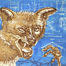
I had a lovely day at Red Hot Press on Saturday teaching four fabulous printmakers how to aquatint. They all worked very enthusiastically and produced some really interesting images. All very different of course. I love teaching.


Tuesday, 20 May 2014

Nearly there...

I'm very nearly there with PB4. Dear me, I don't think I've pulled so many different proofs of a plate before. The problem was, it seems, that I was wedded to colour with this one; sepia, orange and blue. I tried it and tried it and tried it but it just looked like something from the Museum of Bad Art in Boston (sometimes I scan its pages half-dreading, half-hoping I'll see one of my own works in the collection. I wonder if any other artists do that...?) - see below.

 
I gave in finally and went back to fewer and more subtle colours and I think that's what it needs (apologies for the badly-inked proof by the way). Maybe it was too much of a leap for Pirate Baby. It needs a couple of small tweaks but then it's good to go. At last! Thank goodness for that.  I can start on something new now.
 

Wednesday, 14 May 2014

Influences 5 - Freya Payne

At 36 ~ Freya Payne, etching, 2005
I wasn't yet etching when I first came across Freya Payne's work in Printmaking Today in 2006. I was getting some pretty good tone and texture with card cuts but there isn't that versatility of being able to rework and rework and rework the plate like there is with etching. It wasn't until 2009 that I began to use pine resin aquatints to attempt to achieve really tonal / textural effects with etching. And now, five years later, I still can't achieve anything like what Payne does with the plate.

Amateur ~ Freya Payne, 2007
I like portraiture and it remains integral to my work, but I guess my main focus is narrative. Some of Payne's earlier etchings have narrative themes. I particularly like the image below - rather Rego / Hanselaaresque.

Looking for exits - Freya Payne, 1998
In an interview with Katherine Jones (Printmaking Today, Summer 2006), Payne is asked what it is about printmaking that interests her. She replies:

'I love both the physical process and the extended possibilities of a way to draw. The stopping and starting, the slow alchemy of acids and metals; the way drawing becomes an accruing of marks, layer by layer, on a surface physical enough to handle so much alteration, but which still gives an image which feels complete - the journey of the making unified in the final image.

The prints are often testing grounds for installation or sculpture and get fed back into prints as props. The boundaries between what leads the work - concept or process - blur.'

Sisyphus ~ Freya Payne, 2007

On the subject of process, Payne says this:

'When all else is in flux, printmaking gives you somewhere to begin, some parameters, technical anchors. It also gives you a valuable space between the act of making and seeing the result. Often I have very black periods when I lose faith in what I'm doing; this space can be a life raft.' 

How true this is. I've lost count of the times when I've become stuck with an image and found... comfort? Reassurance? New momentum? Simply by cleaning up the plate, degreasing, adding an aquatint and beginning to stop out. All begins to flow again. And the ritual of preparing a new plate when the image isn't fully formed in the mind - the process of filing down the edges, taping the back, degreasing and applying that first hard ground - then the image is ready to trickle onto the plate. I wonder if it's the same for painters preparing a canvas or sculptors doing whatever needs to be done to their chosen medium. I'd be interested to know.


To Turn Again ~ Freya Payne, 2007

Women ~ Freya Payne, 2008

Sunday, 11 May 2014

The Artists Rifles

Portrait of Frederic Lord Leighton by GF Watts


"Are you interested in rifles or are you just here to look at the paintings?"

This was the question posed to me by a gentleman whilst I was standing in front of the above painting at Southampton City Art Gallery last week. I assured hum I was there to look at the paintings; he, on the other hand, looked more of a military history sort of chap, so I wonder what he made of the show (there weren't any actual rifles).

Flowing to the Sea ~ John Everett Millais, 1871
I wasn't quite sure what to expect from this exhibition; here's what the blurb on the art gallery website says.

 'At the outbreak of World War I, Paul Nash, a prominent artist, gave up painting and enlisted in the Artists Rifles, eventually fighting with the Hampshire Regiment. Inspired by his story, this exhibition introduces the Artists Rifles, a volunteer regiment founded in 1860 under the threat of French invasion. Its early membership was a who’s who of the Victorian art world: Burne Jones, Rossetti, Millais, Leighton and Holman Hunt. The Great War saw a new stream of creative people join its ranks: Frank Dobson, Charles Jagger, Wilfred Owen, Edward Thomas and John Nash who went ‘over the top’ with the regiment in 1917. Follow a history of the regiment and its members through a selection of artworks, including loans from the Royal Academy, Imperial War Museum, British Council and Arts Council England.'


The idea of a regiment consisting entirely of artists, poets and other creative types seems somewhat bizarre - the phrase 'herding cats' springs to mind - and having seen the show, I still can't quite get my head around it. It is, however, an interesting mix of art and artifacts. 

Eurydice to Orpheus - Frederic Lord Leighton

There is a great deal of Pre-Raphaelite work, as you might expect - portraits and Victorian narrative paintings (which don't have anything to do with war or the Artists Rifles directly as far as I can tell). The work continues through WWI and WWII with etchings, drawings and paintings by both John and Paul Nash, as well as a series of 1930s (?) posters for fuel. There are many photographs and sketches of the regiment itself (with titles like 'Troops on Wimbledon Common after a skirmish' which baffled me - who could they be skirmishing with?! - until I discovered they trained on Wimbledon Common). There are also cases containing uniforms and various documents and publications relating to the regiment, plus plenty of information panels on the walls (most of which I confess I didn't read, because obviously, I was just there for the paintings...).It's an interesting show though, even if you're not interested in military history, or the Pre Raphaelites for that matter. I recommend it.

CE Perugini ~ Frederic Lord Leighton

Saturday, 10 May 2014

Letterbox Prints go on sale


Letterbox Prints went on sale for the first time last weekend - and seemed quite popular. We sold more packets than I thought we would, so, need to pack a whole bunch more and start taking them round to various art centres and galleries.

Wednesday, 7 May 2014

Edging closer...


... to a resolution for PB4. Goodness, this is a tough one. I console myself with the notion that this is a good sign; it means that I'm pushing myself out of my comfort zone with colour, composition, multi-plateness.

I've etched most of what was on the solar plate onto the etching plate now, which is a bit disappointing really, but hey ho. There is still one section for which I want to use the solar plate (selective inking needed). Also, I think I want to mask out the two figures when rolling on the blue so they don't get lost. They've receded a bit so I need to bring them back into the foreground. It's a way forward anyway... let's see what happens.

Tuesday, 6 May 2014

International Printmaking Day


We had a great day on Saturday at Red Hot Press. The first group of students from the Foundation in Printmaking course have just graduated and had their private view on Thursday so the workshop was open over the long weekend for people to see it. Also showing were Katherine Anteney's Lost in Translation; a series of lovely linocuts based on foreign words for which there is no translation in English.

All that and printmaking demonstrations all day Saturday for International Printmaking Day. I demonstrated etching; Sarah, solar plate; Katherine letterpress and cola litho, and Kevin Dean, monoprinting. We had a steady stream of people visiting and looking at what we were doing. Great fun.

Tuesday, 29 April 2014

PB4 update

I've just realised that I've not blogged about PB4 lately. This is partly because I've been working on other projects and partly because I'm stuck again. Quite a lot has happened to the image but I can't seem to resolve it at the moment.

Following the disaster of the solar plate which, when printed with the etching plate gave me this misregistered monstrosity, and had lost all the diagramatic elements, I decided to add those to the etching plate (see above). I think it works quite well - but took a long time to do which was the point of the solar plate. Sigh... I tried printing over the solar plate with white etching ink but as you can see, too pale.


So. Next step, leave the diagramatic elements uninked and roll relief blue over the the etching plate. Better, but I still don't have some of the text from the original drawing. This is where I'm stuck.


I'm wondering if I can ink up selected areas of the solar plate... This needs time to experiment with, something I don't have an awful lot of right now.


It will happen though. Eventually.

Monday, 21 April 2014

Letterbox Prints - on sale soon


Top to bottom:
JE Manser
Irene Smith, Jo Price
Irene Smith 
Irene Smith, JE Manser
Irene Smith
JE Manser
JE Manser x 2
JE Manser
Sheila Lockyer x 2
Jenny Rickman
Jo Price

Tuesday, 8 April 2014

Stanley Spencer: Heaven in a Hell of War

Stanley Spencer - Bedmaking, oil on canvas, 1932


I'm rather ashamed to say that, although it's pretty much on my doorstep, I've not visited Sandham Memorial Chapel to see Stanley Spencer's paintings. Instead I trekked a bit further last week to see some of them at Pallant House Gallery in Chichester.


Frostbite ~ oil on canvas, 1932
The exhibition consists of sixteen of the paintings from the chapel (which is currently being renovated) and were painted between 1927 and 1932. The images are Spencer’s interpretation of his memories of war; his time at Beaufort War Hospital in Bristol and in the Medical Corp in Macedonia . I was particularly taken by the set of three paintings pictured here: Frostbite, Bedmaking and Tea in the Hospital Ward.

Tea on the Ward ~ oil on canvas, 1932
The colours are rich, the action engaging and the detail fascinating. Of course there is more to them than merely a scene of army hospital life. Spencer imbues the images with symbolism; in Frostbite, the buckets carried by the ward orderly in his white gown transform him into an winged angel; the central figure with outstretched arms in Bedmaking reminds us of the crucifixion; Tea in the Hospital Ward becomes the last supper. It’s the detail and rich pattern that I appreciate most though. The scenes are a riot of patterned wallpapers, fabrics, and carpeting which adds to the busy chaos. These are joyously bustling scenes (which makes me wonder how any of the patients got any rest…), pretty far removed from the horror of the trenches. There is symbolism hiding in the detail too – Spencer's wife Hilda and his father are pictured there. The jigsaw pieces scattered on the table add that little extra detail of daily life on the ward.


Bedmaking ~ detail
A couple of other thoughts: Spencer was a master of material in a all his paintings, very observant of and proficient in rendering surface and texture of materials. The metal buckets in Frostbite, and the tea urns in Filling Tea Urns shine (I can hear them clanging as they knock together), the wooden shelving in Washing Lockers, the towels in Ablutions – one can almost feel the texture, the temperature, soft, hard, cold, warm.
Filling Tea Urns ~ oil on canvas, 1927
I don’t know if it was intentional but all Spencer’s characters seem to be lost in their own thoughts, separate from each other. There seems to be very little acknowledgement between them (Ablutions is a good example). They are preoccupied with what they’re doing, perhaps daydreaming about home and loved-ones as they repeat the daily routine, so practised as to need little concentration. I can only try and imagine what it must have been like; I'm sure that like those in the paintings, I would have followed Spencer in focusing on the 'very happy imaginative feelings' found in the insignificant daily round rather than the desolation of WWI.