Sunday, 19 January 2014

Eric Meadus Part Two: Composition


Park with Houses
Oil on board, 40.5 x 45.7 cm, Southampton City Art Gallery
Okay. Continuing from where I left off, Eric Meadus and composition. What do I want to say about this… I think it’s easy, at first glance, to conclude that Meadus’s work is rather naïve (guilty as charged, Sir) but again, the more of his paintings and drawings I look at, and the more familiar I become with them, I start to see that the compositions are really quite sophisticated. He was prepared to take chances too. Several of his paintings have large expanses of uncluttered sky or foreground such as Park with Houses (above). The placing of the buildings in a strip along the top third of the painting (Rule of Thirds; did Meadus know about this or was it intuition?) leaving the other two thirds as a great swathe of green shows his confidence. Many artists would have felt the need to fill the foreground, or at least have some detail to break it up. The subtle change of greens is all that’s needed to suggest perspective and a change in topography; the eye runs down the slope to the darker plateau assisted by the tree trunk drawing the gaze towards the lower part of the picture plane.


Townscape
Oil on board, 35.5 x 40.4 cm, Southampton City Art Gallery

In Townscape, the buildings take up just the bottom half of the picture with an unrelenting greyish sky spreading across the other. The houses are cropped and stretched and crowded together in a gentle upward slope suggesting squeezed urbanisation below an oppressive winter sky. 


Meadus plays with perspective; flattens out and warps the buildings. Walls almost seem to slide in front of each other to create architectural conundrums which work so well. Railway Station, possibly Woolston, Southampton is a good example. The end of the building, which should recede to the right looks like it has been peeled off the end of the building and pull out to lie parallel with the side. Somehow Meadus gets this to work – it doesn’t jar the eye at all.


Railway Station, possibly Woolston, Southampton
1964, oil on canvas, 49 x 53 cm, Southampton City Art Gallery

There’s loads more I could say about this but this post feels like it’s turning into a critical essay so I shall stop here for today. I still want to say something about his drawings and about his creative drive so I will be back on this subject soon. In the meantime, go and see the exhibitions for yourself and see if you agree with me.

Saturday, 18 January 2014

Eric Meadus - Almost a Meteor

Eric Meadus Portrait of a Bowler Hat 1970 © ‘The First’ Gallery


There are two exhibitions on here in Southampton at the moment of work by the local artist Eric Meadus (1931 to 1970). I went to see them both on Thursday with my Meadus-fan cousin who was visiting for the day. It was a lot to take in; I’ve seen exhibitions of his work before but have never seen so many paintings in one go. My thoughts are still a little scattered about them so I’m hoping that in writing this post, I can sort them out a bit.

I’m really interested in the idea that Meadus was on the cusp of making it big (the exhibition at The First Gallery is titled Eric Meadus – Almost a Meteor) when he died at the horribly young age of 39. He was qualified in technical drawing but other than that, had no artistic training and his creative period was a short fifteen years. What he lacked in art education, he more than made up for in determination and motivation and managed to produce a phenomenal number of drawings and paintings in that time. One can see the experimentation, study and drive in his work and how it progressed and matured over the years; so much so that his first solo show in 1969 sold out. He had come to the attention of LS Lowry who championed him, and galleries in London and Paris were interested in his work. In 1971, the year after his death, one of his paintings was exhibited in the Royal Academy Summer Exhibition. There can be little doubt then, that this self-taught artist had something. How cruel that he should die when he did.

I guess at this point I should say that up until now, I’ve kind of overlooked his work, but the more I see, the more I can appreciate it. Seeing so many of his later paintings at once helped me to see that actually, he was really good with colour and composition. He wasn’t afraid of colour like so many artists can be (myself included!) and had confidence in its use, a real sense of what worked with what. His sister died not long before him; the colours in the paintings around that time change to become sombre and desolate in turn. Brooding, dark blue skies hang over a church in one water colour; searing mustard heavens against the deep red church of another. Off-white expanses above and in the foreground suggest a wintery desolation in a third – not the crisp, bright white of fresh snow, the sort of snow young children happily cavort in watched by their contented parents. These paintings suggest rumination and maybe a preoccupation with death… churches, gravestones; symbols present… They remind me somewhat of the emotion in Van Gogh’s last paintings and indeed, Meadus was a big fan (tragically ironic that he would be just two years older than his favourite artist when he died – are there other parallels…?).

I am going to stop there for the moment as it’s getting late (for me anyway – rock ‘n’ roll kid that I ain’t) and my brain is beginning to seize up. Composition, his drawings, his motivation and drive; these I want to ponder here, so more on Meadus soon.

Sunday, 12 January 2014

New year, new plate

 Decided to start the year with a PB print; this is number four in the series and will be quite different to the first three... solar plate added and colour. Playing around with colour schemes... not sure if I'll go with this but hey, need to make the plate first.

And yes, I am no painter.

Saturday, 11 January 2014

On a local artist by a local writer


Cutting-edge culture from the suburbs?  Yes, council estates and drain covers can be beautiful too, argues Philip Hoare as a new exhibition in Southampton demonstrates.

Read the full article here.

Sunday, 29 December 2013

The Year of Solar Plate

Having reviewed Cowprint's year, it makes sense to look back at my own creative achievements during 2013.

Creatively, the year got off to a slow start as the chickens were keeping me busy with mycoplasmosis, eye operations and feather-plucking, as well as the usual round of mucking out ans feeding etc, so I didn't really get back to printmakung until March. We had dates in May for our first Cowprint exhibition, Imprint, so that spurred me on as I felt that as founder and chair of the group, I ought to produce a new image. Our first session of the year had been a New Year, Old Project session where we had dug out images on which we had got stuck and bounced new ideas around. This was particularly successful for me as got this image going again and finished.

'Roll on civvie life!'  Etching and aquatint


There was a lot to organised for the exhibition and private view; advertising, the hanging, list of works, drinks, sales sheets, browsers etc. All good experience though and the exhibition looked great.  

My next project was to make my edition of 25 prints for the 20:20 print exchange run by Hot Bed Press in Salford. I've not done this project before and it's been a while since I made such a large edition (I'm not a great fan of editioning), but actually, I really enjoyed the whole process. I only pulled a couple of duff prints which signalled to me that my printing skills are vastly improved since my last biggish edition. The spit bite element of this image worked quite well too; need to explore this further.

Alektorophobia - etching, aquatint and spit bite

I've been feeling for some time now that my work needed to change direction; move on as it was feeling a little stagnant. I'd been thinking about adding extra elements, diagramatic elements and layering so in June, I did the solar plate weekend course at Red Hot Press as I thought this technique might help me speed up my processes. What a revelation! Solar plate gave me exactly what I needed in that I can use it in conjunction with etching and drypoint, printed intaglio and / or relief. The plates are quick to make and the quality of the detail is so good, I can use it to make images that would take me ages to etch and wouldn't give the effect I'm after. Here's the two-plate print I made on the course, one printed intaglio, the other relief.

'Singing Masons' - two-plate solar plate print

After that, work began in earnest on the Cowprint calendar image, a panicked combination of solar plate and drypoint as I didn't think I had time for an etching. As it happens, it worked out really well. Thank the gods of printmaking for solar plate!
'Io Saturnalia! - solar plate and drypoint print


The organising and marketing of the calendar kept me pretty busy throughout the summer 
and Autumn; it was a new experience for me working on this sort of commercial venture.

During the Summer I had work in three shows; Double Exposure and Spellbound both at Wool House, and the Red Hot Press Summer show during Open Studios. I did some volunteering at Wool House during August which was great - historically interesting and I met some lovely people.

September was all about the calendar but I also managed to squeeze in a quick 3D project - some drypoint on a plastic piggy bank for the charity fundraiser Go Pig! It was a bit last minute so didn;t work out as well as hoped... I'd quite like to try something similar again though in the interests of getting my prints 'out of the frame' so to speak. More thought needed about this.

Homage to Francis Bacon - drypoint on plastic piggy bank


In November my December print hung alongside my fellow Cowprinters' calendar prints at Red Hot Press for Printer Wonderland; it was sell, sell, sell those calendars! The d.@rt Centre Christmas Fayre at the beginning of December was another first for me. Again, lots to organise but good experience.

In between all the calendar and pre-Christmas hustle and bustle, I still managed to find time to work on my last print of the year, The Chicken Murderer. In this print I was able to combine etching with solar plate for the first time in a two plate print - most satisfying. I've been using more colour this year too... not consciously, it's just the way the work has gone. This too is a good thing.

The Chicken Murderer - Etching, aquatint and solar plate


So, 2013 was a very productive year full of new ventures and exciting developments and I am very happy with the way my work is travelling. Time now to think about planning for 2014.

Friday, 27 December 2013

A year in Cowprint

It’s inevitable, I suppose, that at this time of year, one is drawn to reflect on the year coming to a close. That post-Christmas / pre-New Year week, where everything is so out of the usual routine, is an ideal time to review the events of the previous year and plan for the next.

Cowprint isn’t yet two (we celebrate the group’s second birthday in February) but 2013 has been a great year. We had our first exhibition, Imprint, at the d.@rt Centre in May and high on its success, embarked straightaway on producing the Cowprint 2014 calendar. Lovely prints together with Irene’s stylish layout produced a really professional and marketable object which has sold really well (still a few left if anyone wants one!). It also forced us to choose a name for the group, something we’d been finding somewhat difficult (Cowprint comes from Cattle Market by the way, the building which is now home to Red Hot Press).


At the end of November, Red Hot Press held its annual Christmas event, Printer Wonderland. We were able to display the original calendar prints together and of course, the calendars were on sale along with the prints, framed and unframed. And just a week later, the group had its own stall at the d.@rt Centre Christmas Fayre selling prints, calendars, cards, handmade books, gift tags, paper lanterns and Christmas decorations. We were able to spread to two tables which were crammed with an abundance of lovely papery things.

 
So, Cowprint, which started as a group of artists meeting to share their work and ideas, has evolved this year. Of course, sharing our work is still at the heart of what we do, but now, we have the added motivation of group projects and small commercial ventures. Our next collaboration and first of 2014 is already decided so here’s hoping it will be as enjoyable and successful a year as 2013.


Tuesday, 24 December 2013

Finished at last

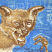
What do the Christmas holidays mean to me? More studio time! The Chicken Murderer is finished (although I need to take some good prints on good paper). I decided it needed something to link the fox and the chicken foot, hence the barbed wire. I also felt a lighter background would work better.

So, here he is in all his bitey ferociousness. Next project already under way...

Sunday, 22 December 2013

The First Cut - paper at the cutting edge


The First Cut is a must-see for printmakers, paper cutters and any artist who uses paper as their base medium. A touring exhibition curated by Manchester Art Gallery, it includes paper cuts and sculptures by Andy Singleton, paper cuts by Rob Ryan, sculptures by Susan Stockwell, Justine Smith, Claire Brewster and Andreas Kocks amongst others, plus a wonderful animation, Going West by Anderson M Studio. These are just a few of the 30 artists who work with paper in unique and inspiring ways to transform it into amazing and beautiful works of art, minute to enormous, displayed in the gallery at the SeaCity Museum here in Southampton.

I think the piece that really blew me away was Andy Singleton's Stellar Spire in the Eagle Nebula, a great, towering black plume of swirling paper suspended from the ceiling, casting the most wonderful shadows on the wall behind. Fabulous.

This exhibition is a real treat for those of us who work with paper; we're not likely to see a show as diverse and comprehensive as this for some time I would imagine, so go see it before it closes on 12 January.


Thursday, 12 December 2013

Cowprint’s first craft fayre


Last Saturday, we spent the day touting our wares at the d.@rtCentre Christmas Fayre. This is the first time Cowprint has had a presence at an event like this so it was an exciting new experience. We had a wide range of handmade, paper-based items for sale; prints, cards, lanterns, notebooks, Christmas decorations, bookmarks, gift tags... Fortunately (for us anyway), the person who was supposed to occupy the table next to ours didn’t turn up so we were able to expand and create a really lovely display (mostly thanks to Irene).
 
There were plenty of people browsing but not so many waving cash at us so takings weren’t great, a sign of the times perhaps. Of the sales we did make, cards seemed to be the most popular. It was a jolly atmosphere though with the other stalls offering jewellery, textiles, cakes etc. There were also children’s activities, a raffle and a choir, just like the fayres I remember as a child, so although we didn't make a great deal of money, I think we all had an enjoyable day.