Saturday, 7 April 2012

Nearly ready to go


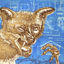
Here’s my edition for Green Door International Print Exchange 2012, all trimmed, numbered, titled, signed and dated. There’s nothing so satisfying as a pile of prints… a whole edition, fresh and neat. Just need to cut the tissue for wrapping and they’re all ready to go.

Friday, 30 March 2012

The creative process

We had the second meeting of our artists’ group this week; another interesting and inspiring session. I took along the first two Captain PB images, the second still in progress. I wasn’t sure if I’d be able to talk coherently about the work (my ideas are still free-floating to some extent) but actually, in putting my ideas out there, it really helped me to consolidate what I’d been thinking about.

I think this series really began last summer when I was sitting in the military cemetery looking at a pile of pine cones I’d collected. What an interesting juxtaposition; all these seeds lying on the surface of the ground, ripe for new beginnings, whilst underneath them, all the bodies of those dead soldiers rest. Lives extinguished. Life and death; beginnings and endings. I started thinking about newness, new beginnings, starting again, blank canvases, clean slates (to coin a phrase or two...). When a person is born (or something is created), there’s all this potential; everything about them is fresh and clean and unaffected by the detritus of life. What would it be like if that were able to continue… if he or she were free to experience life in that fresh, unadulterated way? Inconceivable really; or impossible at least, but an interesting idea to play with maybe. And then Captain PB strolled onto the plate, a little glowing ember of spirited free-will and expectation. Who knows how he will develop and where he will travel.

Really, he’s a metaphor for the creative process; the birth of an idea with all its potential. Quite often, as an image develops and is influenced by other factors, new elements are added and it changes course to become something quite different from that originally imagined. And that’s the most exciting thing about the whole process.

Sunday, 25 March 2012

Bookbinding weekend

What a splendid weekend I’ve just had learning how to make books at Red Hot Press. Over the course of the two days, we learnt how to make three and five-hole pamphlet books, double signature pamphlet books and a variety of concertina books. The really groovy one pictured below is actually much easier to make than it looks.


We also made Japanese stab bound books which are simple enough to build but complicated to stitch together (well, I found them so anyway; my hemp leaf stitch went somewhat awry). This technique can be used to make simple photo albums for example – at some point I would like to compile a book of small prints using this method.


Today we made hard cover books; a five-holed pamphlet book with a hard cover and a 64-page A6 book where the four signatures were sown together with unsupported link stitch – real bookbinding. We even glued the spine with mull and everything. Mine were less than perfect, but oh how satisfying to make. And how much nicer to sketch and write in a book you’ve made yourself. You’ll have to excuse me now as I’m off to drool over bookbinding supplies as Shepherd’s


Sunday, 18 March 2012

vires, virtus, maiestas

The image for my Green Door IPE 2012 submission is now finished, well ahead of schedule (get me) – now the business of printing the edition. It’s been awhile since I printed a whole edition but this is a mini one (just ten) and on a dinky little plate(10 x 7.5cm) so should be a joy to do (hopefully!). There’s great satisfaction to be had from tearing down the paper, pulling the prints, trimming them and cutting the tissue for wrapping; one ends up with a neat little bundle to parcel up lovingly and despatch north.

I particularly like this print exchange because it’s so well organised and the standard of work is high. The parcels of prints we receive back are so well put together and give details of those who took part and those whose prints one receives. I take my hat off to you Green Door; job well done.

Tuesday, 13 March 2012

IPE 2012 submission progresses

Last week was studio-rich. Two good Saturday / Sunday sessions punctuated with a mid-week day off work devoted entirely to etching, culminating in a spring weekend; working on a plate whilst sitting in the sunshine. Studio doors thrown wide, birds singing in the trees, I continued developing my Green Door submission whilst topping up my vitamin D. Does it get better than that?

This image is surprisingly challenging; the plate is only 10 by 7cm and I’m not used to working this small. Inking and wiping is superfast though so it should make printing the edition fairly simple. More work to be done on it before I get to that stage though.

I heard last week that Green Door will be showing the last three years’ worth of International Print Exchange submissions at Derby Arboretum’s Orangery in May, so the Datamonger (submitted for the 2010 exchange) will get an airing; how satisfying. Maybe I’ll pay him a visit.

Monday, 5 March 2012

Spit bite with copper sulphate


Still feeling inspired by the first meeting of our new artists’ group last week, I managed to spend a sizeable chunk of time in the studio over the weekend - and made good progress with the Captain. I tried some spit bite which wasn’t so successful. Using the copper sulphate solution straight from the bath etched a little, as you can see from the above scan; I kept adding more of the etch every five minutes or so, which produced the sort of effect I wanted. However, the bite was so shallow and delicate that I managed to remove it completely when I degreased the plate for the next aquatint. Back to the drawing board.

On googling ‘spit bite with copper sulphate’, I found this rather interesting site which recommends mixing a solution of 800g copper sulphate crystals to 1 litre of water; a much stronger solution than in the bath (which is also partially spent). The images of test strips on the site look promising so my goal for this week is to try it out.

Sunday, 4 March 2012

Emerging from the cave

This week has been Red Hot Press week for me, having spent two very pleasant and inspiring evenings at the workshop. On Tuesday, we held the first meeting of our new artists’ group, the aims of which are for us to give each other much-needed feedback on our work, troubleshoot problems with particular images, bounce ideas around and generally support each other in our practice.

The idea for this came out of a conversation I had with one of the studio directors before Christmas when I was having a rather fallow period with my own work. I’d asked her if she knew of any mentoring schemes; thought this might give me the necessary kick up the backside to get going again. Turns out there’s nothing locally that really fitted with what I wanted. When I half-jokingly suggested it might be something the workshop could think about setting up as a side-line, she asked me how I’d feel about running a crit group. How could I say no?

And it seems I’m not the only one who’s fed up with sitting alone in her cave daubing on the walls; nine of us gathered on Tuesday evening, five bringing work to look at and discuss. We’re not limiting it to printmaking so we had installation work, painting, drawing and digital images as well as prints to consider and feel inspired by. There was a good mix of finished images and work in progress and discussion was free-flowing. I came away feeling really fired up about my own work and anxious to get back into the studio; I think others did too. All in all, a good start to the new group.

Tuesday, 28 February 2012

Teetering toiling, wheeling stumbling...

The initial design and text is etched on the plate; Captain PB is striding forth and gathering momentum. Not quite sure how to manage the background at the moment… some scribbling on copies of the print needed I think.

Tuesday, 21 February 2012

Momentum

The second image in my Captain PB series is well under way; the plate is all ready for its first etching. It feels good that this work is gaining momentum… which I think is the title of this piece. I have no idea where I'm going with this once the initial design is etched but I suspect the Captain knows.

Thursday, 16 February 2012

Yakusha-e: Kabuki prints, a continuing tradition

Yesterday was Excursion Day; Escape From Routine Day, Change of Scene Day, New Input Day. Target destination: the Ashmolean Museum in Oxford to see an exhibition of Japanese prints, wander the antiquity-filled halls and partake of coffee and cake in the café (very good cake it was too).

The exhibition, Yakusha-e: Kabuki prints, a continuing tradition, shows images of Kabuki actors over the centuries . The prints were made by three Japanese artists – Utagawa Kunisada (1786-1864), Toyohara Kunichika (1835-1900) and Tsuruya Kokei (born 1946).

Kabuki theatre began in the early 1600s. The actors became celebrities, much like film stars today, and attracted a huge fan base. There was a high demand for images of the actors which kept the artists busy providing drawings to be made into prints. The drawings would be passed on to engravers who would carve the blocks. These in turn would be handed over to printers for printing. These prints (and those with other subject matter such as landscape and historical images) were known as Ukiyo-e; pictures of the floating world.

A subset of Ukiyo-e, Yakusha-e depict actors striking dramatic poses - ‘mie’. Traditionally these were full-length figures with minimal backgrounds but from the 1790s, artists began to vary the designs to half-length portraits and dramatically cropped views of head and shoulders – Okubi-e. This had the effect of bringing ardent fans closer to their favourite stars (or at least, giving them that feeling), and facial features and expressions could be emphasised. Bright red makeup was used to heighten emotion – I particularly like the images where the subject is cross-eyed; this indicated a moment of emotional climax. They look rather comical but presumably it was all deadly serious. Motifs on the costumes often depicted the content of the play.

I like ukyio-e; but to my untrained eye, they've always looked a bit samey to me. However, seeing the work of Kunisada and Kunichika side by side, the differences in style are quite evident. Kokei’s work is different again and has a more modern, graphic feel to it, and in fact, he carries out all stages of the process himself from drawing to printing - unlike the customary methods followed by Kunisada and Kunichika. He shows though that this 400 year old tradition is still very much continuing. An interesting exhibition should you be in the vicinity before 4 March.


Images from top to bottom:

Cross-eyed villain, Toyohara Kunichika, 1869, 35.5 x 24cm

Actor as Yura Hyogo holding a fan, Utagawa Kunisada, 1852, 35.5 x 24.3cm

Nakamura Tojuro as Kasane, Tsuruya Kokei

Masaoka, Tsuruya Kokei

The Actor Ichikawa Danjuro XII as Sasaki Takatsuna in The Chronicle of Three Generations in Kamakura, Tsuruya Kokei


Sunday, 12 February 2012

Eric Ravilious: terminal optimist

I went to a talk about the life and work of Eric Ravilious this week. I’m familiar with his wood engravings but knew little of his life or his paintings so thought I’d take an early lunch break and trot along to the FOSMAG lecture in town.


Born in 1903, it seems that Ravilious had a pleasant childhood and uneventful adult life (before it was tragically cut short in 1942 when he was just 39). I say uneventful; he married (and had affairs), had three children and a very successful career in design before being commissioned as a war artist at the outbreak of the second world war. I guess what I mean is that as far as I k
now, his life seemed relatively trauma-free. And by all accounts he was terminally cheery. Fellow artist and friend Douglas Percy Bliss said, ‘I never saw him depressed. Even when he fell in love – and that was frequently – he was never submerged by disappointment. Cheerfulness kept creeping in.’ How tiring that must have been for everyone around him.


Even in the throes of war, he seemed abnormally optimistic. About his post in the Observer Corps on Sudbury Hill, he wrote: ‘We wear lifeboatmen's outfits against the weather and tin hats for show. It is like a Boy's Own Paper story, what with spies and passwords and all manner of
nonsense.’ And in the midst of bloody sea battle off the coast of Norway: ‘I enjoyed it a lot, even the bombing which is wonderful fireworks.’ Insane.


This cheeriness filters through to his war paintings, which rather leave me cold. Whilst I don’t dispute that he was a talented artist, to me his watercolours feel like an extension of his design work and have nothing of the horrors of war about them; there’s no angst or real sense of drama. The pale colours and simple shapes might look more at home as fabric designs (I
wouldn’t mind his cheery boats and planes bobbing across my curtains…). His wood engravings on the other hand, are a whole different ball game - much more effective. Think I'll stick with those.


Sunday, 5 February 2012

The Creative Dreamer

I’m reading a rather interesting book at the moment; The creative Dreamer by Veronica Tonay PhD. The subtitle is ‘using your dreams to unlock your creativity’, which sounds a bit cheesy – more cheesy than the book actually is. So far anyway.

The first two thirds of the book are all about the psychology of dreaming, creative personality types and how the two fit together. There are some interesting statistics about the likelihood of creatives experiencing certain events and situations as a child and of the personality traits they may have as an adult. What I wanted to mention here though are the differences researchers have found between how men and women dream. Mostly, both genders dream in a similar way (as do people across cultures), but there a number of differences. Apparently, women dream equally of men and women whereas men dream more often of men. Women dream more often of people familiar to them whereas men dream of strangers more often. Research has shown than aggression is very common in dreams; women dream of themselves as the victims of another’s aggression more often; men have more aggression in their dreams and are more often the initiators than women. Women have roughly the same number of friendly and aggressive dream encounters, whereas mean have aggressive ones more often than friendly ones.

These are the findings having analysed the ‘average’ person’s dreams. Creative people however, seem to be more androgynous in their dreaming; the gender boundaries are blurred and there is more of a mix of the elements mentioned above. This is apparently because creative people tend to be more psychologically androgynous in that they display both feminine and masculine personality traits. Interesting stuff, although not sure where this is all leading. Better read on to find out…

Tuesday, 24 January 2012

It's all in the wiping

The background aquatint is done. It’s a bit darker than I’d planned so the text is hard to read (more so on this scanned version) but I don’t think I mind that. I warmed the plate for the final wiping of the central figure for greater contrast but left the plate cold for the background. Tried wiping it warm to make it a bit lighter but it didn’t look right.

I think this image is finished but I’m not quite sure… I’ll put it away for a few days and come back to it with fresh eyes (hopefully). In the meantime, I’ll consider what Captain PB’s up to next.

Thursday, 19 January 2012

out, out towards the horizon

Finally finished working the text onto the plate; must have taken five hours just to do that bit. The text is just nonsense really. I didn’t want it to say anything specific but to suggest a sense of travelling.

This afternoon I put an aquatint on the plate to darken the area around the figure so that the text recedes a bit. There’ll be a bit of trial and error here to get the tone right; I want the background to be dark enough to bring out the figure without losing the text.